Hot Sauce Brand
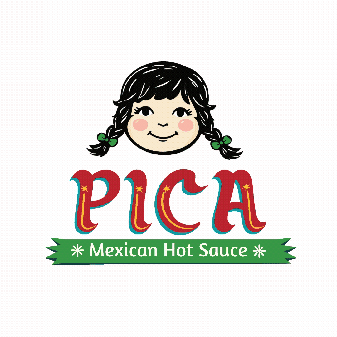
PICA
Branding & Packaging
Pica is a hot sauce brand inspired by “¿A poco pica?”, transforming spice levels into a bold, bilingual, and character-driven experience.

Challenge
Design a hot sauce brand that communicates spice levels intuitively while capturing the handcrafted feel of Mexican rótulos, without looking flat or overly digital.
Insight
Spice is felt through reaction, shaped by culture, humor, and language, and best expressed through authentic, handcrafted visuals.
Design Process
1. Cultural Research
Studied Mexican rótulos, taquería signage, and color palettes to understand composition, lettering style, and visuals.
2. Defining the Concept & Audience
Developed the “¿A poco pica?” concept, defined the target audience, and created a tiered spice system.
3. Character Design
Created Estrellita, a playful “spice tester” who visually communicates heat levels through expressions
4. Visual Exploration
Experimented with type, texture, and color to recreate a hand-painted, organic feel while avoiding a flat digital look
5. Refinement
Balanced expressive typography with hierarchy to ensure readability and impact.
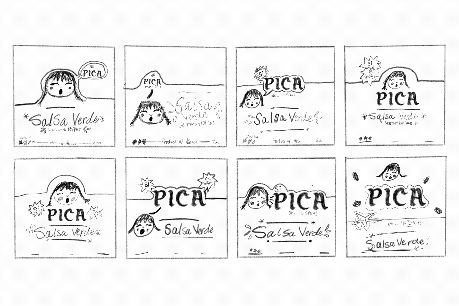
Mascot Appeal
Estrellita connects with the target demographic through her playful, informative personality, appealing to both parents and younger audiences.


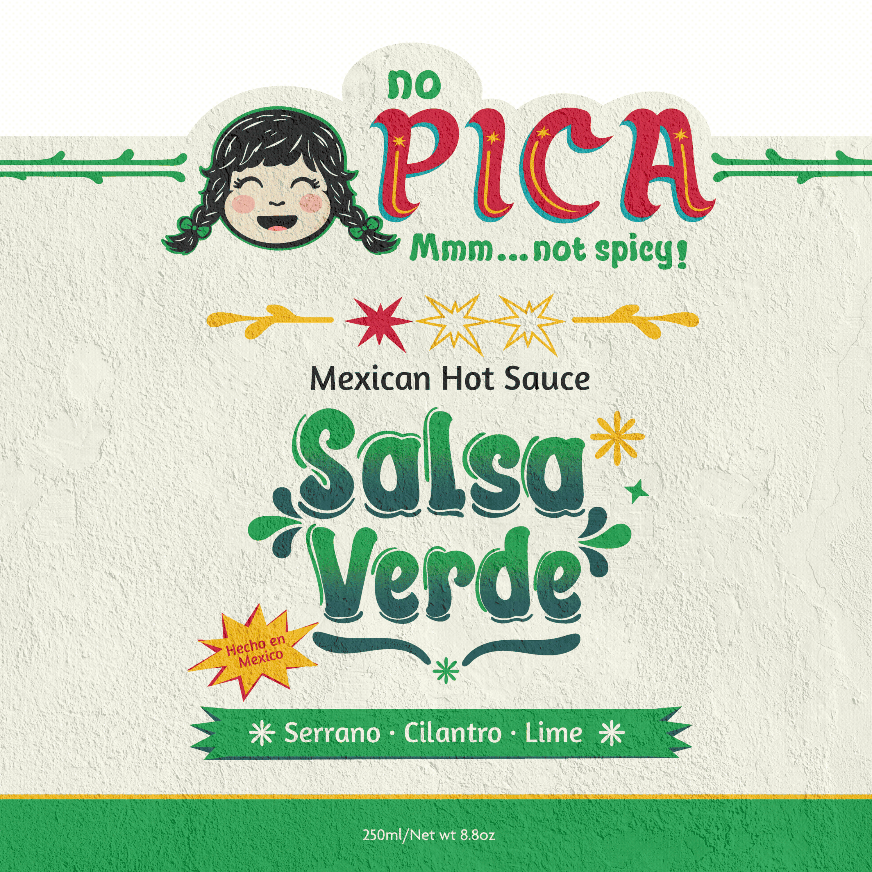
No pica
(Spicy)
No pica
(Not Spicy)
Poco pica
(Mild)
Primary Logo

Logo Type

Brand Typography

Brand Colors
Calm Blue
#1B9FA6
Salsa Verde
#339b46
Cilantro Gren
#134040
Salsa Roja
#BF202F
Banana Pep
#FCBE32
Habanero
#F79521
Solution
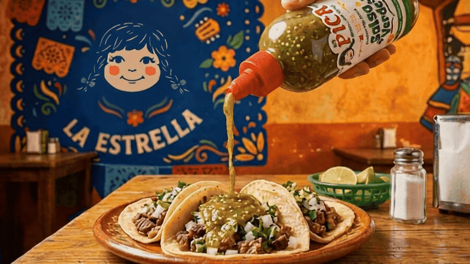
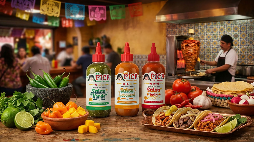
A vibrant, character-driven packaging system that makes spice levels instantly recognizable while capturing the energy and authenticity of Mexican street culture.